Web Design
CLIENT: THE UNIVERSITY OF BRITISH COLUMBIA
Deliverables: web design for instructor-led research project to promote new scholarship on the history of photography, feminist art history and the history of modern Japan.Behind the Camera is an open-source Teaching and Learning website centered around the history of photography in Japan from a feminist lens. It is the result of five years of collaborative information gathering from libraries around the world, bringing together disparate information on women and photography in Japan, so that scholars and students can use it to draw connections and produce new scholarship on this important, understudied subject.
Its Creators, Carrie Cushman (Edith Dale Monson Gallery Director and Curator at the Hartford Art School) and Kelly Midori McCormick (Assistant Professor in the History Department at the University of British Columbia), required a website organized by modules that consist of short lecture videos created by experts in the field; translated primary source materials; annotated bibliographies; and high-resolution images that make research opportunities available to a wider audience.
Web Design
CLIENT: STEPHANIE BLOMKAMP, PHOTOGRAPHER/EDITOR/CURATOR
Deliverables: web design showcasing client’s portfolio and providing information about their expertise, products and services.Stephanie Blomkamp is a Cape Town-based Photographer, Editor and Curator. Her photography has a cinematic edge and centres around surreal and imagined narratives that play with perception, and has exhibited at the Royal Academy of Art in London. Her dedication to photography led to the creation of Oath Magazine—a Biannual new niche publication that champions contemporary African photography—where she continues to work as the Editor. She also lends her expertise to curatorial projects, collaborating with hotels and galleries on various exhibitions.
Stephanie required a professional website to showcase her portfolio and provide information about her expertise, products and services. We worked together to synthesize her vast body of work into an organized site architecture, and opted for a minimal and refined aesthetic. Our simple approach ensured brand consistency with Oath Magazine and universal appeal across a wide audience.
Identity + Packaging
AGENCY: EXHIBIT A DESIGN GROUP
CLIENT: SAVARY ISLAND PIE COMPANY


Deliverables: logo, stationery—business card, stamps and labels—and packaging for several food products.Savary Island Pie Company has been serving up Vancouver’s best pies since 1984. The cozy eatery offers artisanal sweet and savoury pies, sandwiches and freshly baked bread, and serves the gamut of expresso-based drinks.
Aside from its award-winning goods and provisions, Savary is esteemed for its charming decor; the perfect setting to enjoy a slice of ice-cream-topped fruit pie and cup of java. The Ambleside bakery has now expanded its space to include a general store and a Tofino location is also in the works. New business strides called for a cohesive brand image across all products and stationery.
Under the guidance of the Creative Director at Exhibit A: Design Group, I assisted in designing the company’s logo, stationery—business card, stamps and labels—and packaging for several food products. We took inspiration from the Savary story and sought to capture the old-timey nuances of the shop, like the iconic facade and moody palette. The rebrand successfully positioned the company for growth and opportunity, while honouring the vision of founder Eileen Walkem-Hall.
Packaging
AGENCY: EXHIBIT A DESIGN GROUP
CLIENT: LOULOU LOLLIPOP


Deliverables: packaging for 12 baby products, designed to be upcycled and nested for easy storage. Loulou Lollipop is a leading baby brand, founded in Vancouver and family owned. They are redefining baby goods with refreshingly new products that combine a feel-good and memorable aesthetic with safe, high quality materials. Their products are sold at 1000+ gift and baby stores in North America, including Nordstrom, Anthropologie and Crate and Barrel to name a few.
The company has grown rapidly since its inception and required innovative packaging solutions for their evolving product mix and customer base. The scope of the project included complex criteria for international markets and stand-out packaging design with broad appeal.
Under the guidance of the Creative Director at Exhibit A: Design Group, I assisted in designing the packaging for 12 baby products. We opted for proprietary bags and insert cards, designed to be upcycled and nested for easy storage. Many rounds of design specifications, prototypes and refinements resulted in a cohesive and effective packaging system.
Motion Graphics
AGENCY: EXHIBIT A DESIGN GROUP
CLIENT: DUNK POOLS


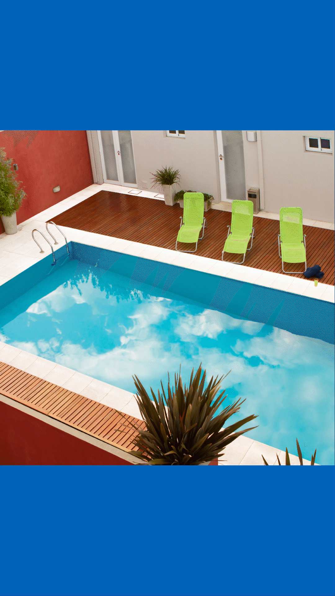

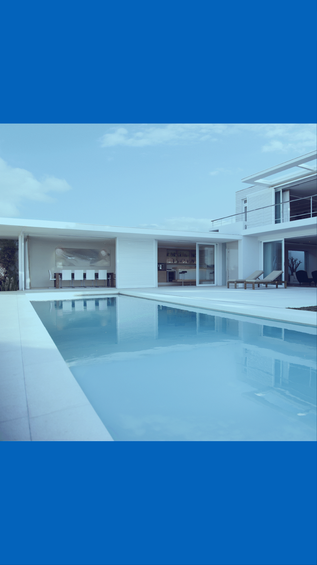
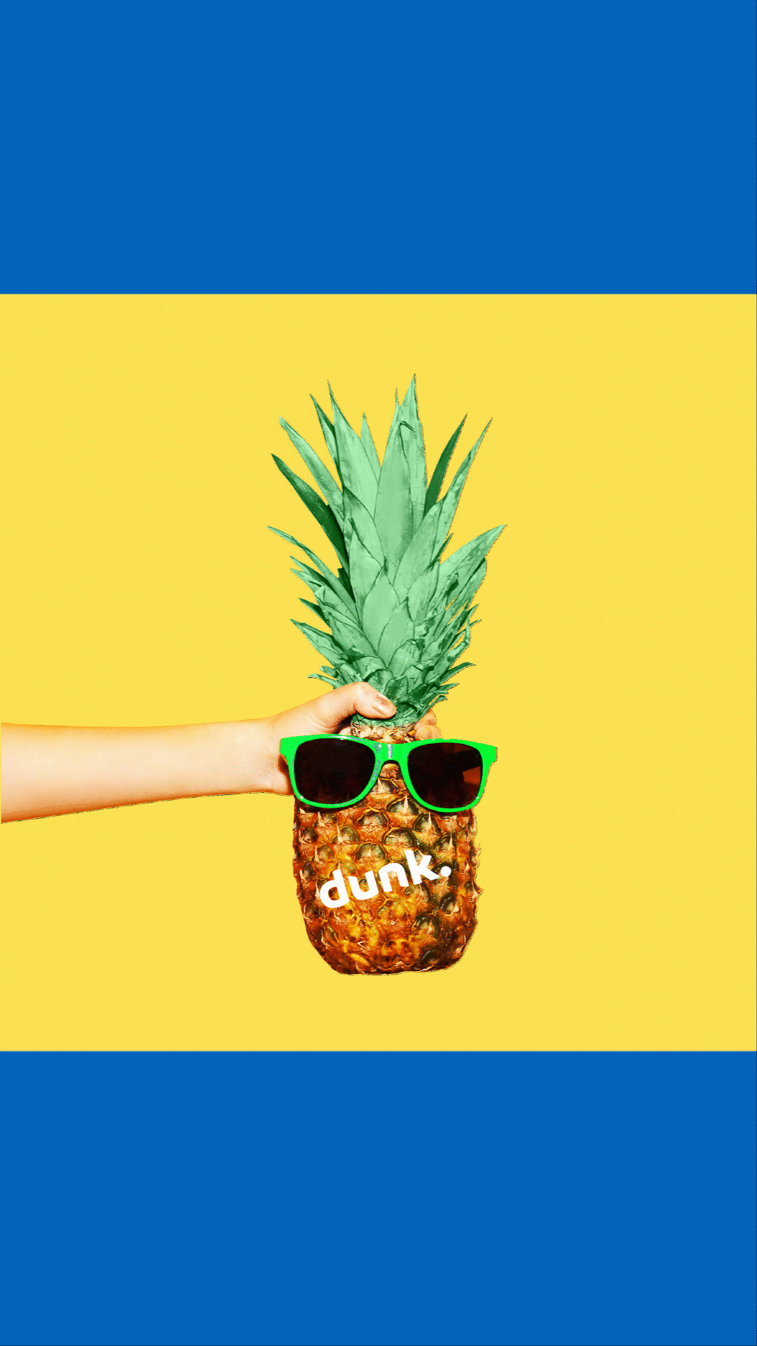
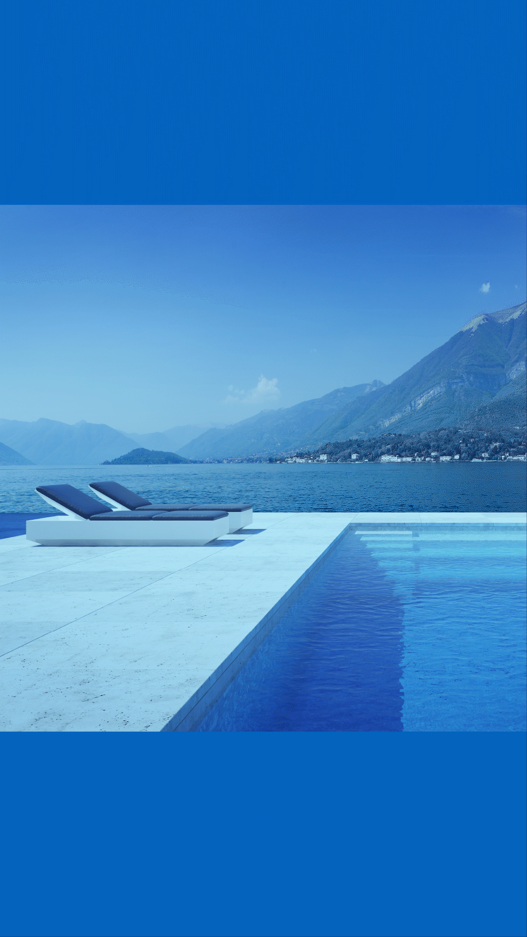
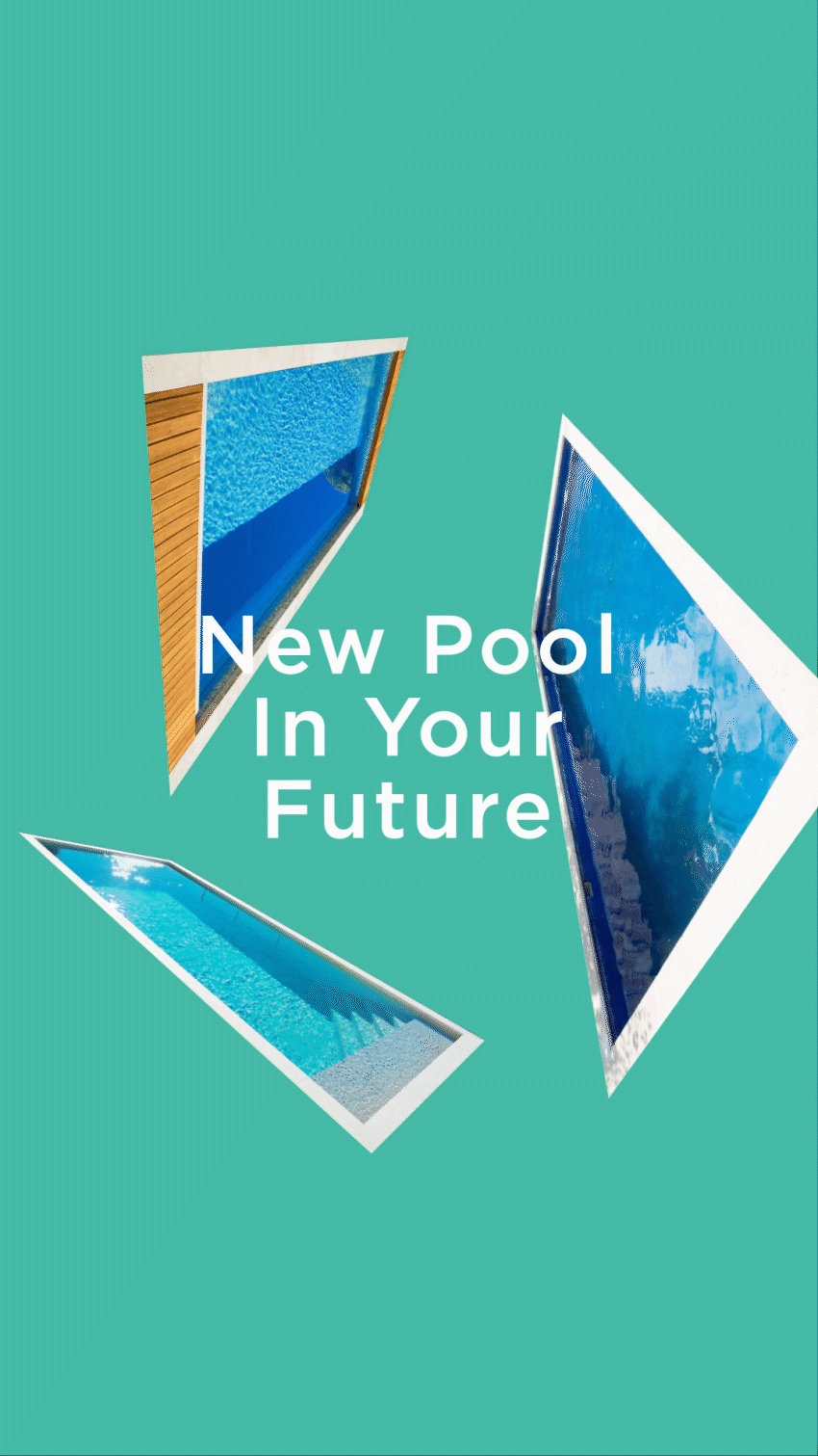


Deliverables: 36 motion graphics for Dunk Pools’ 2020 social media campaign. Dunk Pools is a Nanaimo based custom steel pool manufacturer specialized in building plunge pools. Their all-in-one pool systems are affordable, efficient, relocatable and overflowing with health and lifestyle benefits.
In order to make waves in the growing plunge pool market, the company required a comprehensive marketing campaign. The aim was to deliver educational, entertaining and inspiring content across all social channels to engage audiences.
Under the guidance of the Creative Director at Exhibit A: Design Group, my role was to animate 36 motion graphics for the campaign. The videos were divided into multiple series, targeting the varied customer base. Adding motion to the campaign through dynamic media design proved invaluable with an immediate boost in sales and inquiries.
Identity
CASE STUDY: BARCLAY HARO


Deliverables: multiple logos—combination symbol, signature and mark—and brand guidelines to promote internal and external brand awareness.Barclay Haro is a Vancouver based art practice and an extension of Elise Albino Design, offering limited edition fine art prints, custom works and creative collaborations. The task was twofold: to design a logo that stimulated brand awareness and remained flexible across a variety of media, and to distill all aspects of the brand’s visual language into a set of guidelines.
The primary logo lockup is a combination symbol, including a mark and logotype. Most applications support its unique vertical structure, but the signature and solitary mark provide horizontal and scalable alternatives, if necessary.
The three logo iterations are highlighted in the Identity section of the brand guidelines, followed by Color, Typography, Essence and Imagery. The core and expanded palettes consist of muted hues that are inspired by nature and convey a sense of calm. Futura PT is the selected typeface family: a clean geometric sans serif with a broad range of styles and weights. Beyond design, the values, persona and voice are defined, as well as the central brand concept.
Together, all of the elements provide a succinct snapshot of the brand’s visual language to promote and maintain external brand awareness and to instruct internal parties on proper use.
Editorial
CASE STUDY: STILLNESS MAG


Deliverables: cover, featuring the story, Refettorio Felix; table of contents based on a self-directed editorial lineup and flat plan; and feature layout.Stillness Mag is a minimalist, creative culture and sustainable living publication that features creative practitioners, such as designers, architects and photographers, as well as ideas-based articles. The task was to develop a lineup and flat plan with appropriate content and placement thereof, and to design a cover, table of contents and a feature story layout that adhered to the core principles of editorial design.
The cover type is one-theme, one-image, featuring the lead story, Refettorio Felix. The iconic logo, single cover line and accompanying image are prominent and enticing, and the functional components—issue/season/year, price and barcode—are well arranged. The fresh and simple design is true to the voice of the publication and effectively communicates to the target readership.
The table of contents is based on the lineup and flat plan, providing an overview of the scope of the publication and developing a sense of the editorial mandate. Articles are grouped under standardized departments and key information is highlighted to allow for intuitive navigation.
In the spirit of the publication, the feature story celebrates minimalism, creativity and sustainability and the brilliant work of Michelin star chef, Massimo Bottura and interior designer, Ilse Crawford. The layout demonstrates cohesive art direction, and styling elements are consistent with the cover and table of contents.
Identity
CASE STUDY: LABATT BLUE REBRAND


Deliverables: primary logo, simplified logo and wordmark; packaging—beer can and bottle—and a fresh corporate image for the current market.Labatt Blue is a leading national domestic beer brand produced by Labatt, an internationally renowned Canadian brewer. The task was to redesign the organization’s logo and packaging to appeal to the current global market.
Roots-proud, quality and refreshment—these words define Labatt Blue and drive the creative direction of the rebrand. The design style across all collateral pieces boldly unveils Labatt Blue’s rich heritage with a fresh new appeal.
The logo is the focal point of the comprehensive brand identity and features a digital rendering of a hand-drawn illustration depicting the organization’s historic former brewery. Three variations, including the full logo, simplified version and wordmark, offer flexibility and accommodate the different applications.
Labatt Blue’s repository of historic ephemera provides a wealth of inspiration; for example, one of the selected fonts is reminiscent of a condensed geometric typeface found on a century-old packaging label. While the redesigned media presents a modernized corporate image, Labatt’s history is honored and preserved in the subtle details of the project.
Packaging
CASE STUDY: SADE LP RECORD + LABELS


Deliverables: artwork for LP record and labels to appeal to the millenial generation and redefine the artist's album/image for the current market.Sade is a British Nigerian singer-songwriter who gained widespread critical acclaim as a top-selling soul and pop artist in the 1980s. The task was to redesign a 12-inch LP record and labels for her album, Diamond Life, to appeal to the millennial generation. Viewing the artwork at a small scale and product placement online and in-store were important considerations.
The music packaging design translates Sade’s unique voice into a visual language, represented by sand imagery that conveys her smooth sound. New technology is leveraged to manipulate the desert landscapes into futuristic digital renderings: color bars and floating geometric shapes. The special effects and abstract arrangement breathe new life into Sade’s image and bridge the gap between her style of music and the younger audience.
Identity + Web Design
CASE STUDY: ARBUTUS MIGRATORY BIRD SANCTUARY


Deliverables: logo; stationery system, including letterhead, second sheet, business card, #10 envelope and mailing label; and corporate website.Arbutus Migratory Bird Sanctuary is a wildlife refuge for millions of birds and offers feeding and resting areas during their annual migrations along the Pacific Coast. The task was to design a logo for the organization, aimed at their target audience, and to create a stationery system and website tailored to their corporate vernacular and branding.
The logo is a combination symbol, including a mark and logotype, inspired by the V-formation of flights of birds. Together, the two segments create an arrow shape that symbolizes migration. The logo is applied to a set of business papers—letterhead, business card, envelope and mailing label—to carry the corporate identity throughout all internal and external facets of the organization.
In addition to print media, the website provides a digital adaptation of the brand. Dynamic imagery and graphic devices convey movement and support the migratory theme, and expressive typography and color expand the visual language.